- Home
- China
- World
- Europe
- Politics
- Business
- Opinions
- Tech & Sci
- Culture
- Sports
- Travel
- Nature
- Picture
- Video
- Live
- TV
- Specials

Share

Copied
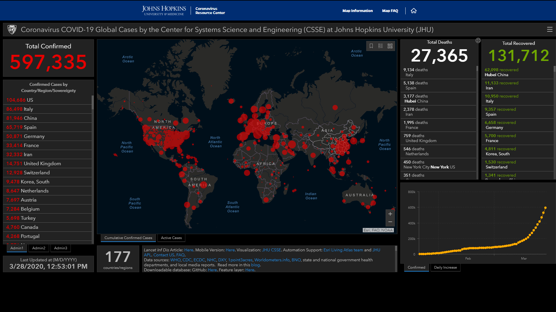
As the coronavirus pandemic unfolds, you might be hearing a lot about "Johns Hopkins University" in the news. The university built an interactive dashboard to visualize and track global data on COVID-19 in real time.
As COVID-19 pandemic is developing around the world, most of the countries report data of newly and total confirmed cases on a daily basis, and data is often organized and released by government departments.
The U.S. is an exception. When reporting about the outbreak in the U.S., international media and American local news agencies, including The Associated Press, The Hill and CBS, often reference to real time data from Johns Hopkins University's dashboard.
Launched on January 22, the dashboard reports cases at the province level in China, at the city level in the U.S, Australia, and Canada, and at the country level for other situations.
Why is Johns Hopkins' dashboard data reliable?
According to the university, the dashboard uses data from government bodies including the U.S. Centers for Disease Control and Prevention (U.S. CDC), the European Center for Disease Prevention and Control (ECDC), and the National Health Commission of China, and other organizations like the World Health Organization (WHO), local media reports, and the DXY, one of the world's largest online communities for physicians, health care professionals, pharmacies, and health facilities.
The map is maintained in near real time throughout the day through a combination of manual and automated updating, said the university.
Data of total confirmed COVID-19 cases in the U.S. from WHO, ECDC and Johns Hopkins University were nearly identical in the early stage of the pandemic, according to Our World in Data.
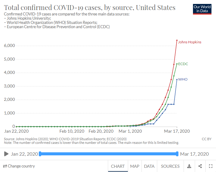
Screenshot via Our World in Data
From March 10, data from Johns Hopkins have shown significantly higher numbers than other sources, probably, because the university also includes estimates of presumptive positive cases.
Presumptive positive cases are those that have been confirmed by state or local labs but not by national labs, Our World in Data wrote.
The U.S. CDC said on its website earlier this month that if there is a discrepancy between the number of cases reported by the CDC, and state and local public health officials, the state-reported data should be considered up to date, which means Johns Hopkins' data is more timely.
In an article titled "The most reliable coronavirus dashboards" on Digital Trends, the dashboard of Johns Hopkins University is also identified as "updated the most often."
Behind the dashboard
The entire concept and visualization of the dashboard were prepared by a civil and systems engineering professor, Lauren Gardner, and two Chinese students, Dong Ensheng and Du Hongru – both first-year Ph.D. students at the University's Center for Systems Science and Engineering.
Dong told a local Chinese media outlet that on March 12, the dashboard got two billion hits from the entire world in a single day. They also co-authored a short piece explaining the dashboard, which was published on the world-leading medical journal The Lancet on February 19.
(Cover: Screenshot via Johns Hopkins University)