Smartphone
23:03, 04-Mar-2018
Do we really need all-screen smartphones?
By Gong Zhe

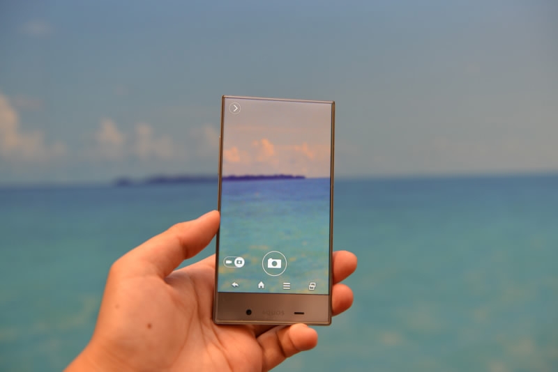
The latest trend in the smartphone industry falls again on the screen. All-screen, bezel-less, 18:9...whatever the name is, it means a phone with only a touchscreen on its front.
In a lot of people's minds, an all-screen phone should look really cool, like in this picture:

Picture from K-tai Watch
Picture from K-tai Watch
But none of the current products can provide such a feeling constantly.
In this year's Mobile World Congress (MWC), a lot of phone makers are trying to convince users that all-screen is the future.
The solutions
Samsung continued its effort by further shrinking the top and bottom bezels in the latest S9 model. But it looks very similar to its brother S8, only with the fingerprint scanner placed in the middle.

Samsung S9 looks similar to S8 in a lot of ways. /VCG Photo
Samsung S9 looks similar to S8 in a lot of ways. /VCG Photo
A team of makers from south China's Shenzhen showcased how fast they can "learn" from the Apple design with a bunch of Android phones that have all those "notches" very similar to the iPhone X.
Apple chose the irregular shape to cope with its 3D face scanner. But the Shenzhen copycats don't have such technology at hand.
This phenomenon is familiar. When Apple killed the headphone jack on iPhone 7, other producers followed up. Apple has AirPods to compensate (if not improve), but what do the others have?
And after all, wired headphones tend to have better sound quality, just like the good old fingerprint scanner works better than face scanning (in a lot of scenarios).
Even the stubborn Sony surrendered to the all-screen trend, significantly reducing the bezel size in its latest Xperia XZ2.
And of course, the big all-screen player Xiaomi is also releasing a new Mix 2S phone. But the look of that phone has not been confirmed yet.
The winner of the MWC all-screen game should be Vivo, which brought out a concept phone called the Apex, successfully dealing with the hard part: the front-facing camera.
The Chinese company has already managed to merge the fingerprint scanner with the screen (thanks to touch device giant Synaptics), now they also merged the selfie camera with...the middle frame.
The camera is hidden inside the phone when not needed and will pop up if you want a selfie.
With Apex, the producers have finally cleared the way to a 100 percent screen ratio on the front of the phone.
Great! But is that what you actually want? Or will it do you any good?
All-screen troubles
There are phone parts that should stay on the front. Take the earpiece as the first example. Manufacturers like Xiaomi moved the earpiece to the top edge leading to the trouble of sound leaking. Your phone calls can be heard by others more easily, which means that when you make a private call, you'd better use the headphone.
Along with the earpiece, there is the proximity sensor, which detects the distance between you and your phone. And when it's too close (like during a phone call) it tells the phone to shut the touchscreen down in order to prevent touches by mistake.
The sensor's best position is on the front, the same direction as the touchscreen. Moving it elsewhere can reduce the accuracy.
The most serious problem, as mentioned above, is the selfie camera, which has to face forward to "see" the user and get the job done.
That's why iPhone X has the notch and Vivo Apex has the "pop-up" camera.
But the notch feels weird to some and the "pop-up" mechanism may break more easily than expected.
After all, is it really necessary to have a 100 percent all-screen phone? Is the trade-off too big for a cool-looking feature?
We may have to wait until the market heat has gone to get the answer.

SITEMAP
Copyright © 2018 CGTN. Beijing ICP prepared NO.16065310-3
Copyright © 2018 CGTN. Beijing ICP prepared NO.16065310-3